Mapping sales at World Wide Importers
(graded individual assignment #10)
You are a recently hired consultant at World Wide Importers (WWI), a global trading company that sells various novelty goods to businesses throughout the US.
The CEO believes that her management needs a better handle on the company data, and has purchased a license for Tableau. As a first proof-of-concept, she would like to build a dashboard to monitor sales by quarter and by geographical region. Many of your colleagues have passed on the opportunity to create the first real-time visualization for WWI, claiming various forms of allergy to learning new technologies, but not you. This is your chance to shine.
GOAL: Learning how to use Tableau in a realistic environment.
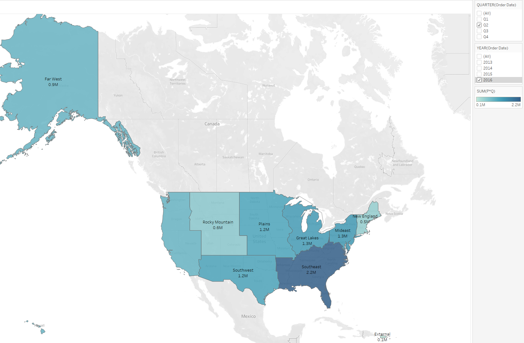
TASK: This is a pledged individual assignment. Work on your own. Access a database called WWImporters on the course server and use the data contained in it to build a visualization that shows sales (ignore taxes) by quarter and by geographical region. The visualization should be similar to the pic below. Deeper blue means stronger sales.
Once you have done it, post the .twb file produced by Tableau on your Box folder.
CRITERIA: filters must work, numbers must be correct. If you cannot get the map to work, see if you can build a table that shows sales by region (filtered by quarter) for partial credit.
The hard part of this exercise is to figure out where is the data, what it means, and how to make Tableau work as desired. If you know what you are doing, this will take 15 minutes or so. Expect to spend way more than that (x10) to complete this assignment.
Here I provide a few hints and suggestions.
1. Begin by connecting to the DB using ADS. This will ensure that you can access the data. You will discover that the DB contains over 50 tables! Most of them are not relevant to your task, but you will have to decide which ones you need to download to Tableau. The tables are organized into schemas, so you might have to use their extended names (e.g., schema_name.table_name). You will need to study the tables and their columns. Visualize both the table structure and the data in them. Take notes.
2. Use Power Pivot to get an automatic ERD of the content of the database. It is as simple as pressing a button in the app. Again, you will have to find the button on your own. This step is optional. If you think that you do not need an ERD, skip it.
3. Start Tableau, and ingest the tables that you need. Then connect them using their foreign keys.
4. You might need to create calculated columns.
5. Before charting, make sure that Tableau knows the right data types: for example, that it knows which columns contain geographical information. Else it will not map correctly, or at all.
6. Be patient. There is a lot of data to draw, and Tableau might appear not responsive.
7. If you have some unrecognized values ('unknowns') click on them and edit them.
8. Explore the options until you get what you see in the pic. Google and the demo in the previous Tableau assignment are your friends. This step can be frustrating. Tableau is not as easy to use as their marketing messaging suggests when you are facing a realistic task. Give yourself plenty of time. Take a break if you feel like punching the screen. You will succeed (eventually)! If you cannot get the map to work, see if you can build a table that shows sales by region (filtered by quarter) for partial credit.